talk
„I’m a bit of a fan of hyper-capitalist design myself”
Jan Baszak in conversation with Jagna Domżalska
-
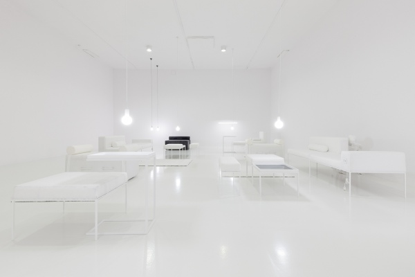
Jagna Domżalska: The situation that you have arranged in the exhibition 1.9 m at the Project Room seems very simple, and yet a great many threads can be discerned here. It is hard to say whether any of those are more important than others – and that is precisely what you wanted.
- Jan Baszak: Yes, several issues have contributed to shape this exhibition, but none can be said to dominate. I like it too when other artists leave things open in a show or a particular work. But not too open either.
-
You mean an open-ended situation, i.e. leaving things unsaid, not suggesting an interpretation, right?
- Not suggesting an interpretation, I’d say. Although it seems to me that the exhibition statement contains many clues, perhaps not direct ones, but clues you can nevertheless follow (or not). But my perspective on the legibility of this show is not too objective. On the other hand, it’s always nice when people try to figure it out according to their logic, perhaps it’s even more interesting.
-
But in this case you have left a number of clues, not all being as obvious as the inspiration with hotel lobbies or shopping-mall seating areas.
- The form of the hotel lobby seems to be a function of all these more or less veiled clues. This exhibition is about sculpture and about an experience of space, but in an existential and social sense rather than a spiritual and metaphysical one. There is also a bit there about classism and an incompatibility, and at the same time a nostalgia, or rather a regret, that one is not in what one wants to be, but it would be better to reject it intentionally rather than because one is not there. While thinking about this, an image quite naturally occurred to me of over-designed quasi-domestic… well, perhaps not domestic, but cosy interiors, which in fact are a vision or simulation of domestic warmth rather than actual cosiness. What interests me in these lobbies is the specific choreography that takes place there. I’m a bit of a fan of hyper-capitalist design myself. I like everything that’s a remixed version of an original idea, reduced to the “everything for a dime” category. Not a 3D-cat-postcard dime, though, but that which fits in the category of pretty.
-
Yes, your sculptures are copies of luxury furniture, but made with low-quality materials.
- I deliberately used materials that come out on top when you type in “upholstery velour” on an e-commerce site and sort the results by lowest price first. Quite like sculptures, these fabrics pretend to be something that they are not. Velour, as is well known, is a must-have product in interior design today, so it’s easy to dive into an ocean of faux-velour fabrics, their prices starting from a modest 7 zlotys per running metre. It seemed natural to me that if I wanted to stage a situation that would be more or less a portrait, I should use such fabrics that pretend to be something that they are not.
-
For these are copies of copies of designer furniture pieces. You reiterate the idea of the copy in the very construction of the show: you had produced a furniture set, and then made mirror-image renditions of each of the pieces.
- Yes, the mirror image is present here for several reasons. Firstly, it is a motif that was once used in residential architecture, but later only in luxury interiors for the reason that mirror image in interior spaces is said to be highly impractical. Mirror reflection is still used, but only to emphasize the luxury or uniqueness of the given interior, and I guess mostly in spaces meant to impress guests. I’ve used it in connection with the remixing strategy mentioned above, but also because I love DIY work, or generally the idea of home improvement. There’s a vast number of tutorials on YouTube showing all kinds of tips and tricks to modernize your home and make your habitation more aesthetically pleasing. Tutorials that tell you how to, without spending too much money, create an object from the “must-have” category mentioned above. And the effect is often a beautifully jagged version of the original. Producing this exhibition, I wanted for every sculpture/furniture piece to already have its copy. Something like conveyor-belt assembly, only this time without a conveyor belt and limited to one person and two pieces of furniture. And although these are only two pieces, I guess they offer some comparison, and you can notice that the sculptures, though similar, are in fact different. Which is of course a result of my incompetence.
-
Well, I see it as a result of manual work and craft-learning. But let us stress: these are realistic sculptural representations of pieces of furniture. You make them yourself, strictly by the book, and upholster them yourself too. The scene you’ve arranged seems taken straight from a promo shoot for a home-décor magazine. However, you show furniture without users.
- Yes, I should have explained that it’s not so much hotel lobbies in themselves that this show is about as precisely their documentation that can be found in interior-design magazines or at design websites. Photography always imposes a perspective on how you look at things. In this case, this is obvious.
- I guess this imposition of a certain gaze in photography and my desire to reproduce this kind of situation, i.e. to impose a looking perspective, are the reason why these furniture pieces/sculptures are personalized for one particular dimension.
-
Yes, you’ve mentioned the self-portraitive character of this exhibition. The pieces are adapted to the size of a person 190 cm tall, i.e. they are raised by 3 cm.
- Well, I guess it’s precisely this sabotage against dimensions that’s most self-portraitive.
-
The issue of how dimensions are understood in design is one that you’ve studied before. You work with the choreography of everyday life and have analyzed how you yourself deviate from the standard furniture proportions.
- I don’t know if I work with the choreography of everyday life, perhaps I just like to watch it, and watch myself being its participant. But I don’t mean how the contemporary economy determines the division of the day between work, sleep, and leisure. I’m interested in simple mechanisms, for example how we behave in a new place. Or how we get anxious and almost panic when we can’t find something we’re used to, how having familiar things within reach makes us feel more at home. If someone’s moved our favourite whatnot, we feel estranged. This is what I’m interested in. And all that is opposed to those designed dimensions, which are extremely simplified and standardized to fit in corporate spreadsheets. Like framing in interior-design photography, they impose a perspective. And it’s the small things that make a space one’s own.
- Assembling the show, one of the things we paid attention to was how you can sit on the given sofa or easy chair. We tried to design a situation – a choreography – in this space. Which, in confrontation with reality, would probably work out differently, like those footpaths worn into the grass that break away from paved sidewalks.
-
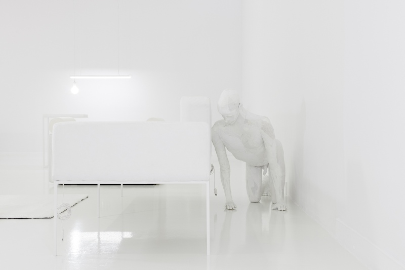
Yes, we thought about it, but there was no permission for sitting. Put shortly, these are indeed fully practical pieces of furniture, but they are sculptures. Void matters here too, there are no people (models from those catalogues you’ve mentioned), but there’s one hidden figure.
- There are no people in those pictures either, only signs that someone’s been here, perhaps they sat down, the blanket being crumpled, or drank some coffee, the cup being half-empty. There’s a figure here, and at the same time it’s kind of not. I have ambivalent feelings about it, and it too changed its place: first it was meant as a “stumble-upon” display piece in front of the gallery, then it was to stand in the separate corridor in the Project Room itself, and finally it hid itself behind one of the sofas. This sculpture is also a bit of a furniture piece. It’s made with similar materials, and the very pose of the sculpture/”boy” resembles a low table or a footrest.
-
For me, furniture pieces become figures here, and a figure a furniture piece. It’s also important how you made it. An analogy with how you made the furniture pieces – with a hard frame and fabrics – matters, but tell us about your method of sculpting, which you also employed in your graduation project: you use textiles, but treat them like clay.
- Yes, the process of making this figure or the grad-project series was very much like working with clay. First a rather solid wooden frame is made, to which are attached PVC pipes, which add volume. The fabric is mounted piece by piece directly on the frame. It is hand-sewn, unseamed, and added again. Thus I sculpt. The system means that the sculptures are not as worked-up as in clay. Whether I want it or not, the effect is slightly flawed. There is something very attractive in sewing. Even if I can’t quite put my finger on what it is and why.
-
It is about the manual aspect, direct experience of the medium? Agency? Or some mantra? What also matters here is the kind of materials used and the fact that they are related to the body. In your MFA project, those were your used socks; here it’s white T-shirts, something that’s as close to the body as a comfy sofa can be.
- It’s probably about the experience of the medium too, but I guess agency is the main reason why I do what I do; and mantra probably plays a part too. In these sculptures I use second-hand materials because they’ve been in touch with the body and are no longer perfect, but also because you never really know what you’re going to get. What I mean is that white T-shirts, or rather tank-tops, even though similar, are different: each has a different shade of white, texture, smell, size – everything. This means that the final effect is always surprising. Moreover, these materials are simply inexpensive, available almost immediately, and while this is not art about recycling, the recycled-ness of the works is still an aspect that I’m very okay with here. And perhaps it’s not so true about the inexpensiveness, come to think of it, for when you buy so many black socks at a second-hand store, you can be in for a surprise at the checkout. But it’s still below the price of, say, resin.
-
Whence the analogy with working in clay?
- From the beginning of my art studies, I guess. In the freshman and sophomore years of the Sculpture course at the University of the Arts in Poznań, we had to sculpt nudes in clay, then do a plaster cast. When I started working with textile sculptures, I somehow naturally approached it in the same way, adding bit by bit, and sometimes subtracting if something was off.
-
But here it’s also about realism. About imitating reality, even if someone could say that exhibition looks rather like a Constructivist composition. You’re a highly skilled sculptor. It isn’t a problem for you to make a realistic sculpture in the classical vein.
- I don’t know whether I’m a skilled sculptor because working realistically has always been a bit of a problem for me. But when I do something, I reproduce the real thing with a kind of sabotage. True, the show resembles a Constructivist composition, but doesn’t every clearance sale at Leroy Merlin resemble it?
-
It does, and that’s what the realism of these works is about. What also matters to me is the aspect of their functionality, which remains unused. There are USB sockets in the sofas and chairs, there are lamps overhead, but no one reads there anything.
- The USB sockets are there because today all, well, not all, but most of public furniture has electric sockets. This situates them in a particular timeframe. And as I browsed through the catalogues of companies that manufacture such furniture and came upon a piece without a socket, I’d wonder when it was made. It’s also a nice-looking feature. The sockets in the sculptures/furniture pieces are actually in perfect working order, if connected to a mains, they’d be perfectly usable. But you don’t sit on those sofas, and don’t plug into those sockets. This underscores the documented, catalogue-like situation, where we can only imagine ourselves as users. But in these unconnected sockets there is also something about setting up somewhere for a while only, something about scattering your stuff around a strange place to make it a little bit more familiar.
-
Yes, you inhabit the space to some extent, but at the same time you strongly emphasize the temporariness. But it’s a situation that’s easy to change: you bring it in – you bring it out. You haven’t ventured to intervene, to mark the territory.
- I haven’t because I’m not really a rebel by nature. It’s about inhabiting, but without burdening anyone with extra work, except perhaps myself. It’s like urine-marking an area, but without the urine.
-
Yes, you don’t urine-mark the area, you’ve marked it only discreetly, symbolically. You’ve seemingly filled it completely, but everything is white and delicate.
- It’s white because when I think of classical sculpture, I think of white statues. White velour too is completely impractical, attracts dirt. But I guess it was the idea that these furniture pieces should be not-for-use sculptures that made me do it all in white.
-
As you’ve mentioned, we eventually agreed that it was an exhibition about sculpture. About realism in sculpture and the sculptor’s self-reflection. About relating to the notion of the sculptor.
- For me, all this connects into a single whole: in stereotypical thinking, the notion of the sculptor doesn’t differ from the notion of the user of a chair.
-
Like the systemic dimensions, which haven’t been standardized, after all, but adjusted to specific dimensions. To someone’s particular perspective.
- Yes. I like all those tiny changes of the angle of looking at something, someone, or myself. I don’t like radicalisms, and in those small shifts, the effort is often incommensurate with the effect, which seems somehow beautiful. To change the perspective ever so slightly, just a tiny bit, you often need a lot of physical (and probably also mental) work, which could shift something much further as well.
-
You’ve produced a work that has a lot of momentum, but is highly nuanced in various respects.
- That’s true, the show has many nuances, which I’ve already mentioned before. The respective pairs differ in those tiny defects and the degree of random dinginess. So let’s say it “conveyor-belt assembly” in a DIY spirit. Although 190 cm is a static exhibition, in some these nuances and details are responsible for ocular choreography. I like all these fuck-ups that you need some time to notice. It works a bit like a painting or a photograph, where first you take in the whole thing, and only then begin to notice all the details. I also like the difference between documentation and how the show actually looks like. I very much wanted for the publicity pictures of the works to resemble a 3D render, but for everything to be actually at least slightly off. It’s a bit like with those products from the discount aisle at the supermarket –in a way, they’re trash, but still usable, a small blemish or stain being their only defect.


